Eventi Hotel, L'amico & The Vine

Chef Laurent Tourondel wanted a restaurant identity inspired by a wood-fired meal and the simplicity of a stroll through the countryside.

Client
Reunion Goods & Services
Role
Project Manager / Producer
Services
Identity, Brand Collateral, UX Product Management

About the project

Kimpton’s Hotel Eventi (Chelsea, NYC) houses multiple dining concepts including L’Amico (by chef Laurent Tourondel) and The Vine; Eventi’s site highlights L’Amico as its flagship Italian-influenced restaurant on property.
Reunion Goods & Services is a NYC studio known for multi-disciplinary hospitality work (architecture, interiors, and branding).

Role

Project Manager / Producer (and hands-on designer) at Reunion G&S

  • Oversaw a small creative team: 1 graphic designer + Creative Director (Eric).
  • Acted as client-facing PM, translating brand/ops needs into actionable design & build tasks.
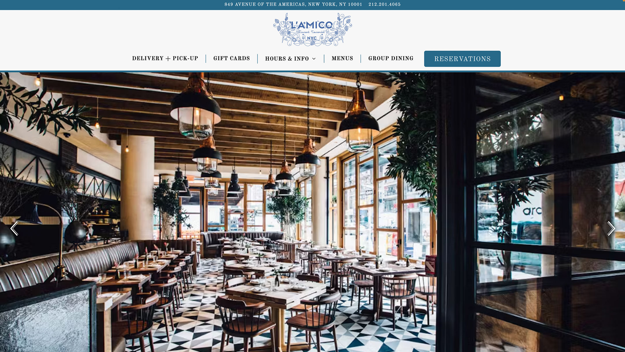
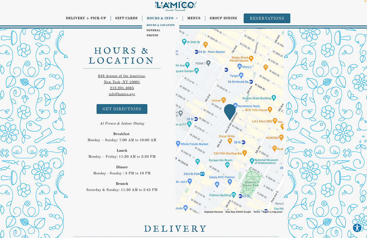
  • Managed single-page website production (layout originally styled in InDesign/Illustrator), coordinated with a remote dev team (India) via Basecamp, and served as the sole product designer reporting progress to the CD.
  • Owned print production readiness: enforced printer specs, schedules, proofing, and delivery.

Key deliverables I produced/managed.
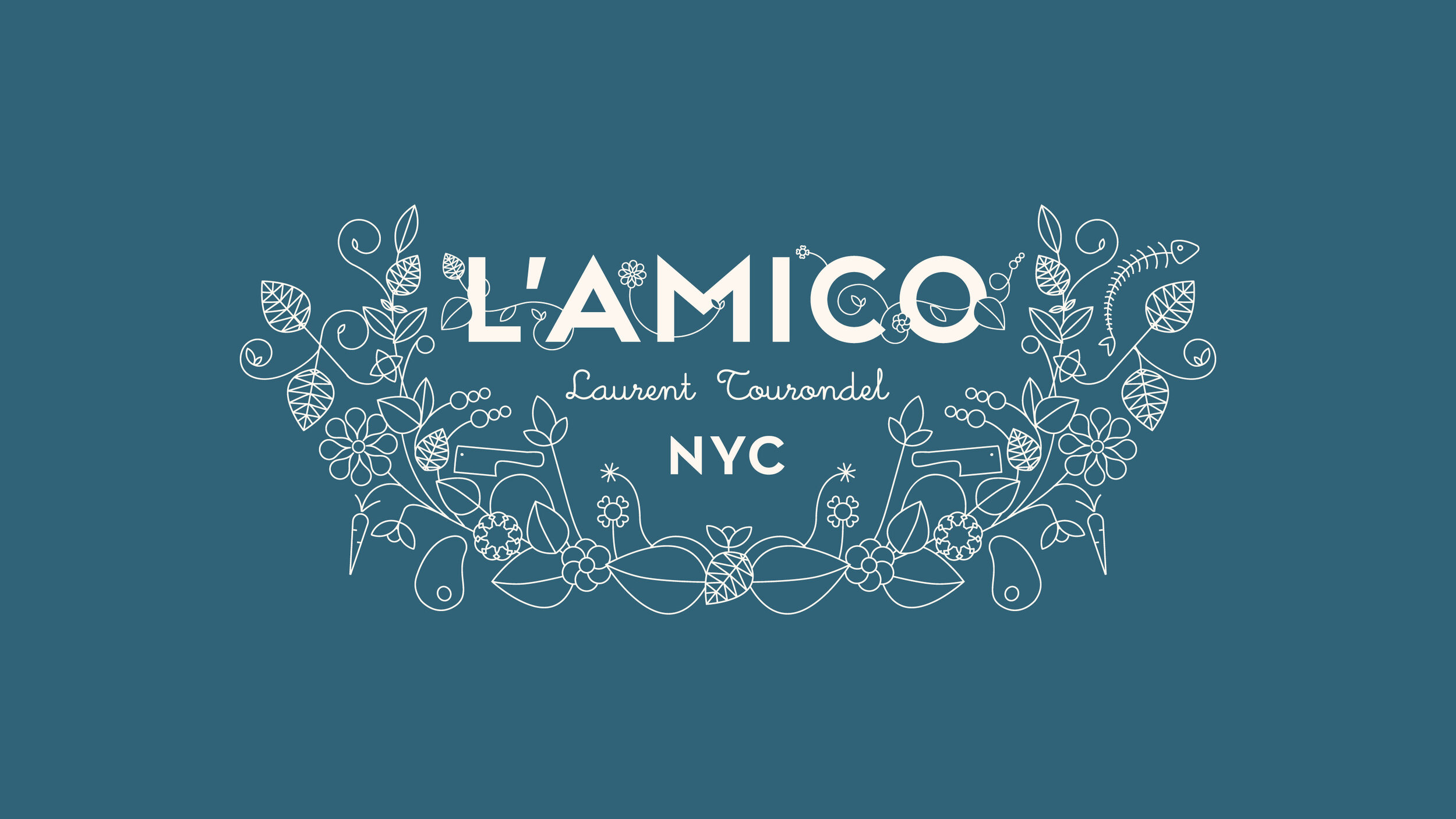
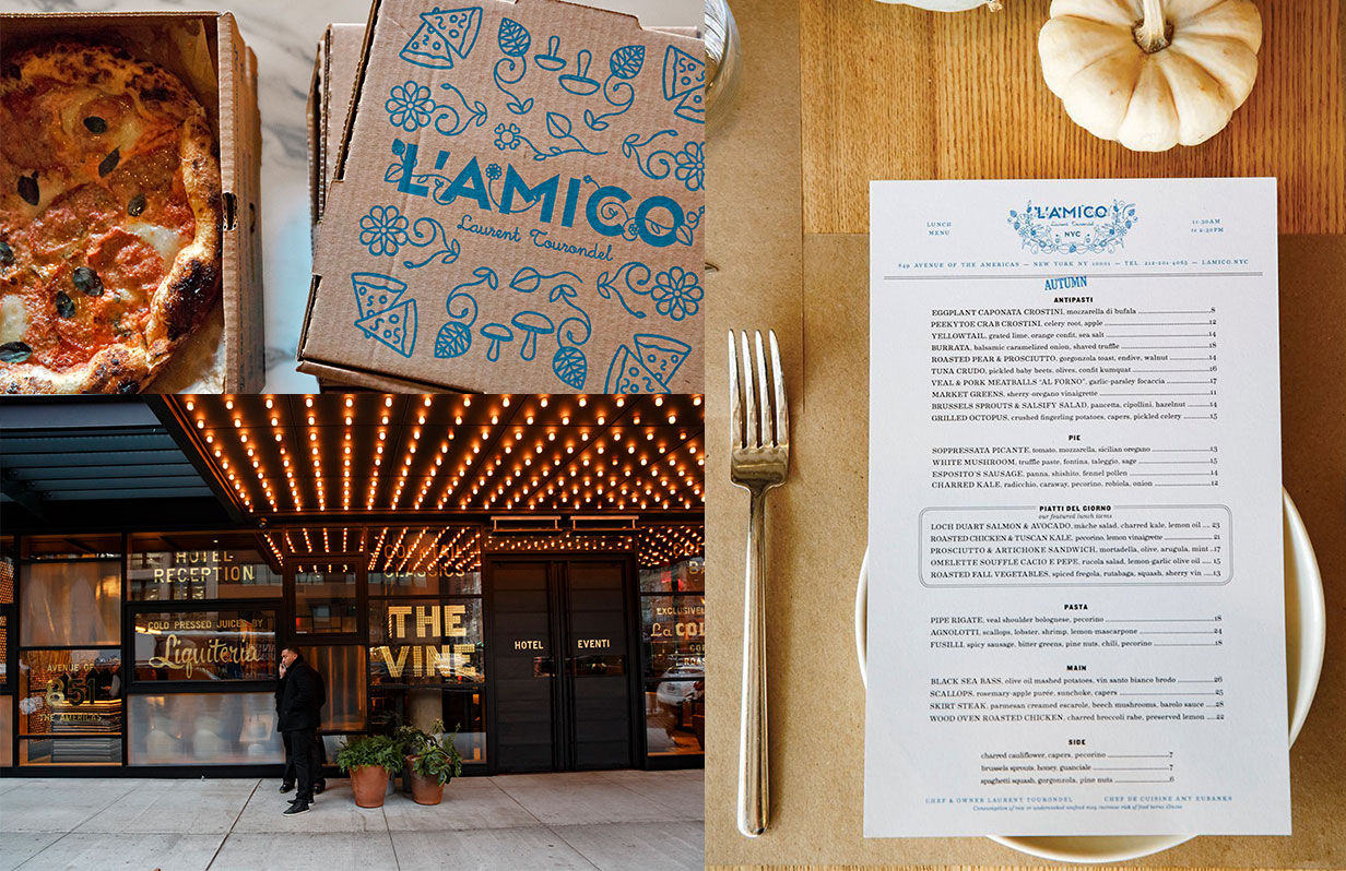
  • Custom pizza box (L’Amico): dieline ownership, ink/stock spec, proofing, vendor handoff.
  • Branded pen (guest-use/promotional): color match, imprint method (pad/screen/laser), MOQs/supplier management.
  • Matchbox: Specced book-style matchboxes with PMS color match and a foil-stamped logo; managed dielines, required safety copy, and vendor proofs to ensure crisp imprint and compliant production.
  • Coasters: Produced double-sided coasters on 60–80pt pulpboard with edge-to-edge artwork; selected a moisture-resistant varnish and oversaw press checks for color consistency across reorders.
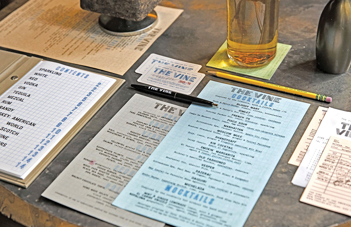
  • Menus (L’Amico & The Vine): design, binding/presentation system, paper selection, finishing, press checks; maintained change-log to keep bar / dessert versions in sync.
  • 2 Single-page websites: responsive asset spec, font-loading plan, border-element scaling rules, Instagram integration.

Web

I launched 2 high-fidelity one-page sites that retained the editorial look across common device widths. Employing bi-weekly QA cycles and a rigorous spec/handoff package, I achieved faster approvals and on-time delivery of the project.

Approach

  • Design Fidelity → Web Reality. Translated InDesign/Illustrator compositions into dev-ready assets; documented type pairing, spacing systems, and breakpoints to protect hierarchy on mobile and ultra-wide.
  • Spec’d the decorative border as a container-locked element (background-positioned within a wrapper) with max-width/aspect-ratio constraints so it scaled without overlapping content.
  • Established a font-loading strategy (preload + fallbacks) to minimize layout shift and preserve the brand’s typographic voice.
  • Managed a single-page website build via Basecamp with an offshore dev team; ran a production calendar from content lock → annotated screenshots → QA sign-off.

Challenges

  • Maintaining editorial typography and layout fidelity across breakpoints.
  • Ensuring the mid-page ornamental border scaled for large screens without encroaching on body copy.
  • Handling custom brand fonts on the web without FOIT/layout shift.
  • Coordinating remote development across time zones while keeping specs unambiguous.

Solutions

  • Delivered a tight handoff kit (redlines, asset slices, spacing tokens, breakpoint rules) to reduce interpretation gaps.
  • Implemented the container-locked border with guardrails (max-width + aspect-ratio) to prevent overlap.
  • Deployed preload + robust font fallbacks and set acceptable reflow thresholds.
  • Kept a defect log + weekly updates to compress QA cycles and maintain momentum.

Print

Approach

  • Print & Collateral Readiness. Built press-ready files (bleeds, dielines, color profiles) and coordinated with vendors to meet on-site opening dates.
  • Implemented a change-control log to keep last-minute menu/collateral updates consistent across locations and versions.
  • Defined a menu presentation system (design, paper selection, binding/finishing) optimized for luxury, durability, and quick page swaps.
  • Managed a production calendar: proofs, sign-offs, ship dates; maintained alignment via annotated updates.

Challenges

  • Translating brand textures/tones to production-safe builds across multiple vendors.
  • Tight openings & staggered approvals with frequent, last-minute menu changes.
  • Balancing durability vs. aesthetics for high-touch menu handling (bar/spills, daily wear).
  • Packaging constraints for the pizza box, matchbox, and coasters.

Solutions

  • Standardized vendor spec packs (color profiles, dielines, coatings, trim/bleed rules) to reduce variability and reprints.
  • Ran a structured update cadence with a single source of truth for all menu versions (room service / bar / dessert, etc.).
  • Selected use-case-specific materials (water-resistant stocks for bar; heavier covers + Chicago screws/hidden posts and leather presentations for dining).
  • Coordinated proofs and on-press checks; aligned packaging lead times and food-contact compliance through vendor documentation.

Outcomes

  • Reduced pre-press errors and reprints via standardized specs and proof protocols.
  • On-time delivery for openings despite late content changes.
  • A menu system that balanced tactile brand feel with the ability for house staff to update daily for specials, seasonal beverages, and their extensive offerings of beer, wine, and liquors.
  • Packaging that met structural + food-safe requirements while hitting the visual brief.

Interested in working together? Get in touch today.

Discover the difference diverse expertise and passion can make. Reach out for a collaborative partnership focused on your success.